Red Cross visual identity
This page contains instructions and definitions for the visual identity of the Finnish Red Cross and production instructions for materials. The charter provides tools for successful, distinguishable and identifiable communications.
The most important element of the Red Cross brand is meeting others courageously and building trust between various operators. Our brand needs to be recognisable and distinguishable in both rapid crises and in the digital influx of information.
Basic elements
A red cross on a white background is a special emblem, because it is intended to protect authorised medical institutions and transports, their staff and patients as well as International Red Cross aid workers and transports during conflicts. States own this international sign of protection, which doubles as the identifier for the medical services of the defence forces of these countries.
The red cross is presented alone, without any explanations and only in a select few instances. It is not the symbol of first aid, but the Red Cross may use it to signify medical emergency services.
Read more about the protecting red cross, red crescent and red crystal symbol: www.redcross.fi/our-work/the-red-cross-symbol/.
In any unclear situations, or if you see that the symbol is used incorrectly, please contact
the Finnish Red Cross communications department or legal advisor
info@punainenristi.fi or 020 701 2000.

The logo consists of the logo symbol (cross) and logotype (text). The logo is always used on a white background. The logo files are available in the media bank.

Districts, branches and institutions use their own logos in connection with their operations.
You can find the separate instructions for companies on using the logo here (link later).
Exclusion zone
The logo must always be used on a white background, the minimum size of which is the exclusion zone. The exclusion zone is twice the length of the arm of the cross. No other elements may be placed in the exclusion zone.
The relation of the logo symbol and the logotype may not be changed and the exclusion zone may not be broken.

Prohibited uses

The logo will not stand out sufficiently on a coloured background. The logo will also not be distinguishable on top of an image. There is no negative version of the symbol. The logo may be distorted in an electronic format. Always check that the proportions are correct.
Logo colours
Logo colours may not be changed. There is no white (negative) version of the logo. Select the correct colour version of the logo for the purpose to ensure that the hues are reproduced correctly. The RGB versions are primarily intended for electronic use and the CMYK versions for prints.
Minimum size
The logo may not be used in a smaller size than specified here.

Black and white
It is not recommended that the logo be used in black and white printed products. The logo may be printed using a black and white printer for printed materials.
Language versions
A Swedish-language version of the Finnish Red Cross logo along with other language versions are also available. In the interest of clarity, the full name of the organisation is provided in the language in question.
In international contexts, it is possible to use the Finnish-language logo and write the official name of our organisation in the language in question next to it.
In situations that require three or more languages, the logo version with the primary language is chosen and the remaining languages are written as additional information next to the logo.
The use of the logo is governed by the same rules as the use of the Finnish-language version.


Branches and districts primarily use a dedicated branch or district logo in their own communications and materials. It increases the recognition of local activities, highlights the organisational structure and directs any contacts to the right place.
Branch and district logos are only created in the Communications services unit. Logos may not be produced by branches and districts or commissioned from third parties. Please contact aineistot@punainenristi.fi, when necessary. You can find logos in the media bank.
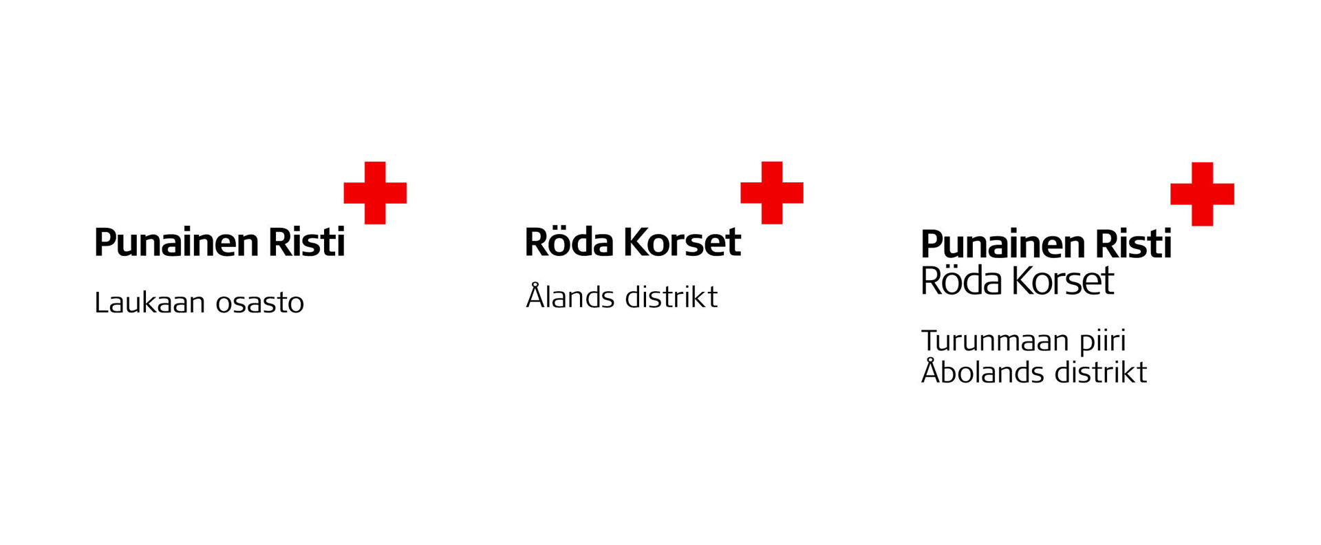
Regional operators, such as reception centres or flea markets, are displayed next to the district logo. The nature of the operations is provided under the name of the district in accordance with the example.
Logos are only created in the Communications services unit. Logos may not be produced by branches and districts or commissioned from third parties. Please contact aineistot@punainenristi.fi, when necessary. You can find logos in the media bank.

The Finnish Red Cross institutions – Blood Service, Kontti and Youth Shelter – have their own logos where the name of the institution is displayed together with the organisation logo.
There are Swedish and English versions of the logos of the institutions. Any additional languages are written together with the logo similarly to the name of the branch, for example.
Logos are available in our media bank: aineistopankki.punainenristi.fi.

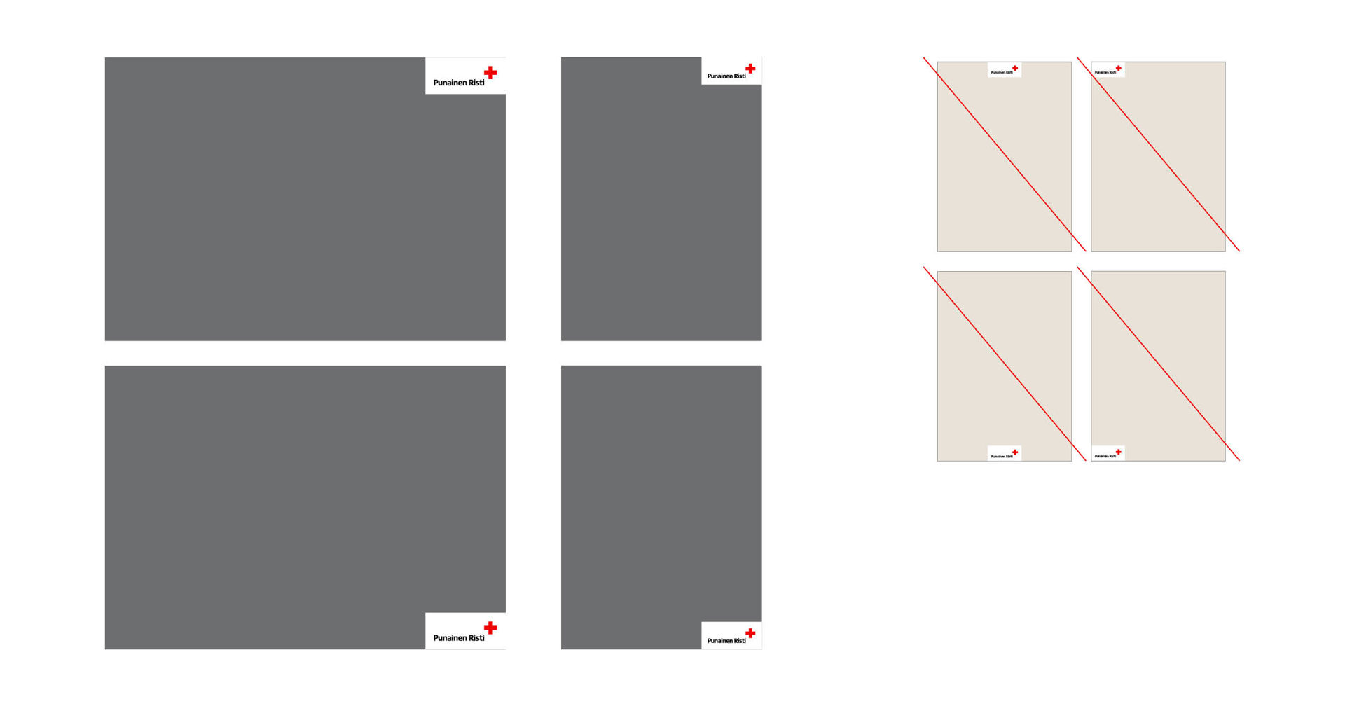
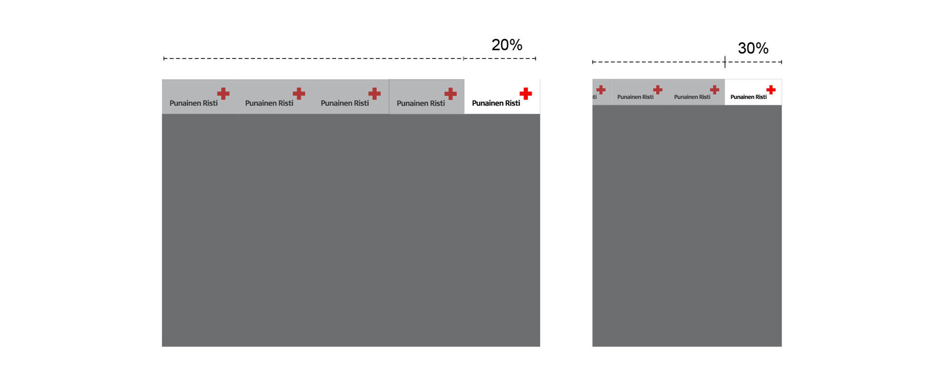
The ratio of the size of the logo to the material being produced has been determined in advance. In horizontal materials, the width of the logo is 20% of the overall width and in vertical materials the width is 30% of the total width.
The logo is always placed in the right top or bottom corner with two sides touching the sides of the material. The logo has already been positioned correctly in all readymade templates. Do not change the location or size of the logo in readymade templates.
Logo size with exclusion zone
Horizontal A4: width 59.4 mm, height 27 mm
Vertical A4: width 63 mm, height 28.8 mm
Horizontal A5: width 42 mm, height 19.2 mm
Vertical A5: width 43.81 mm, height 20 mm
Please note!
In any materials smaller than A6, the logo is larger in relation to the size of the material (e.g. business cards).
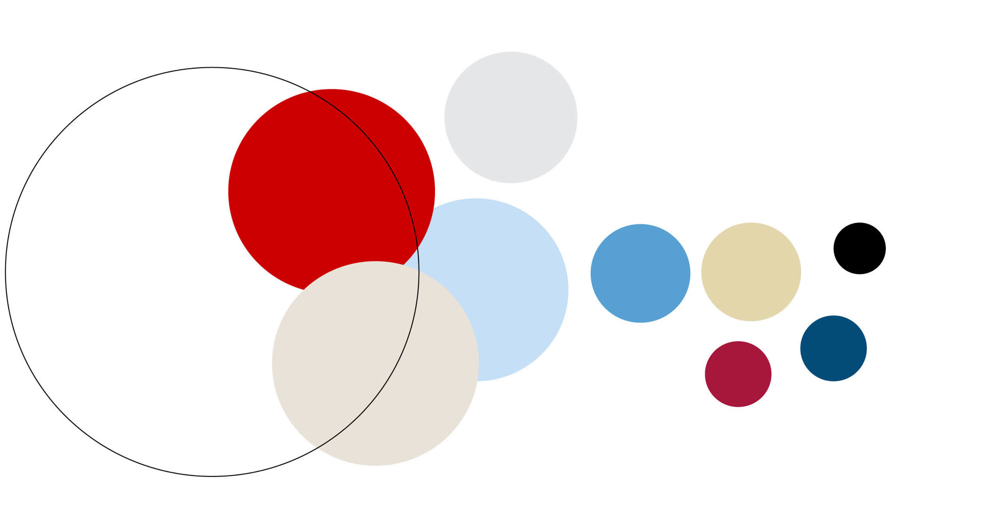
The use of primary colours, neutral colours and supporting colours create identifiable yet versatile visuals.
Primary colours
Primary colours are at the core of the Red Cross’s visual identity. They represent confidence, boldness and reliability.

Neutrals
Neutral tones are warm and grounding.

Supporting colours
Supporting colours make room for visual expression from strength to sensitivity.

Proportions
Instructions on how to use the colours in relation to each other.
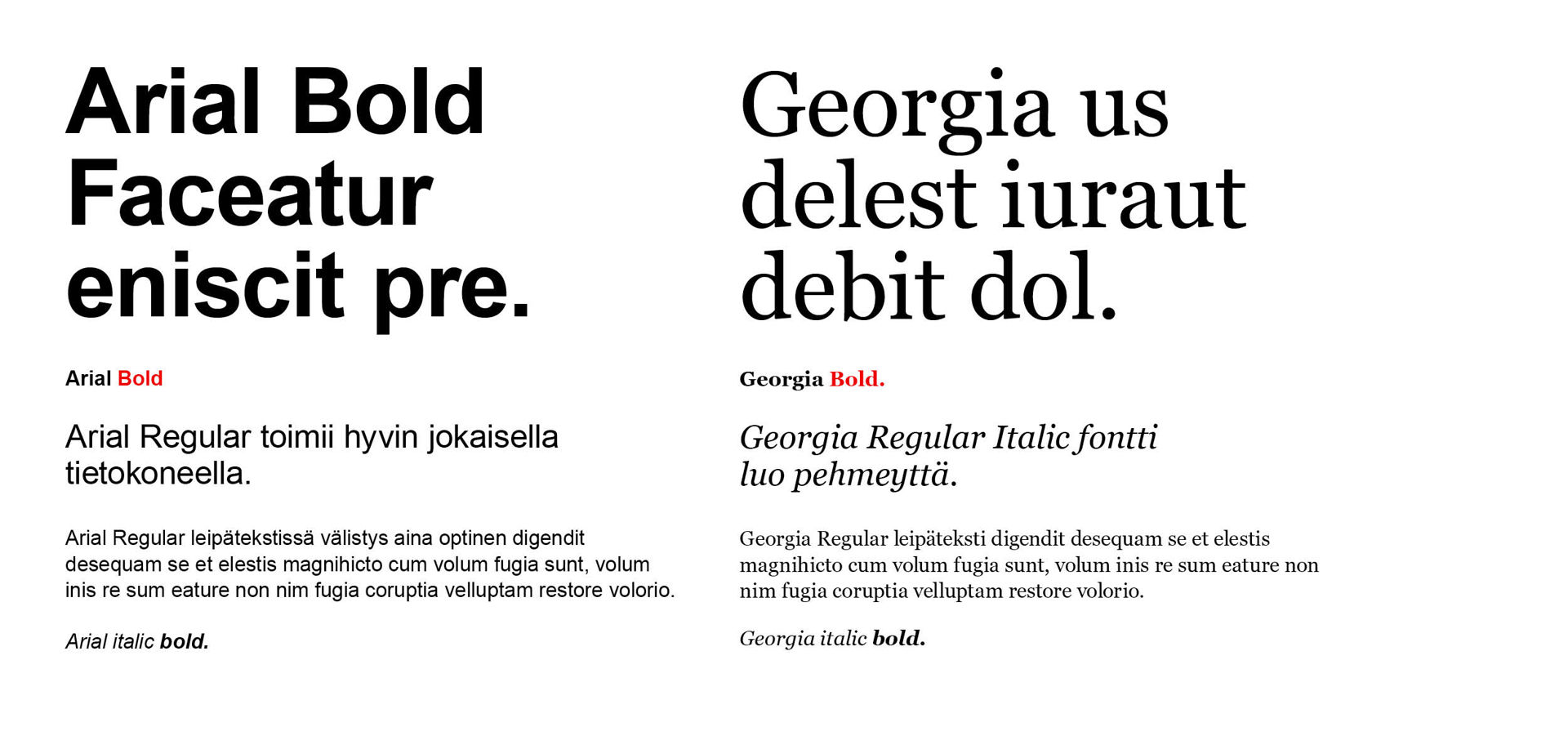
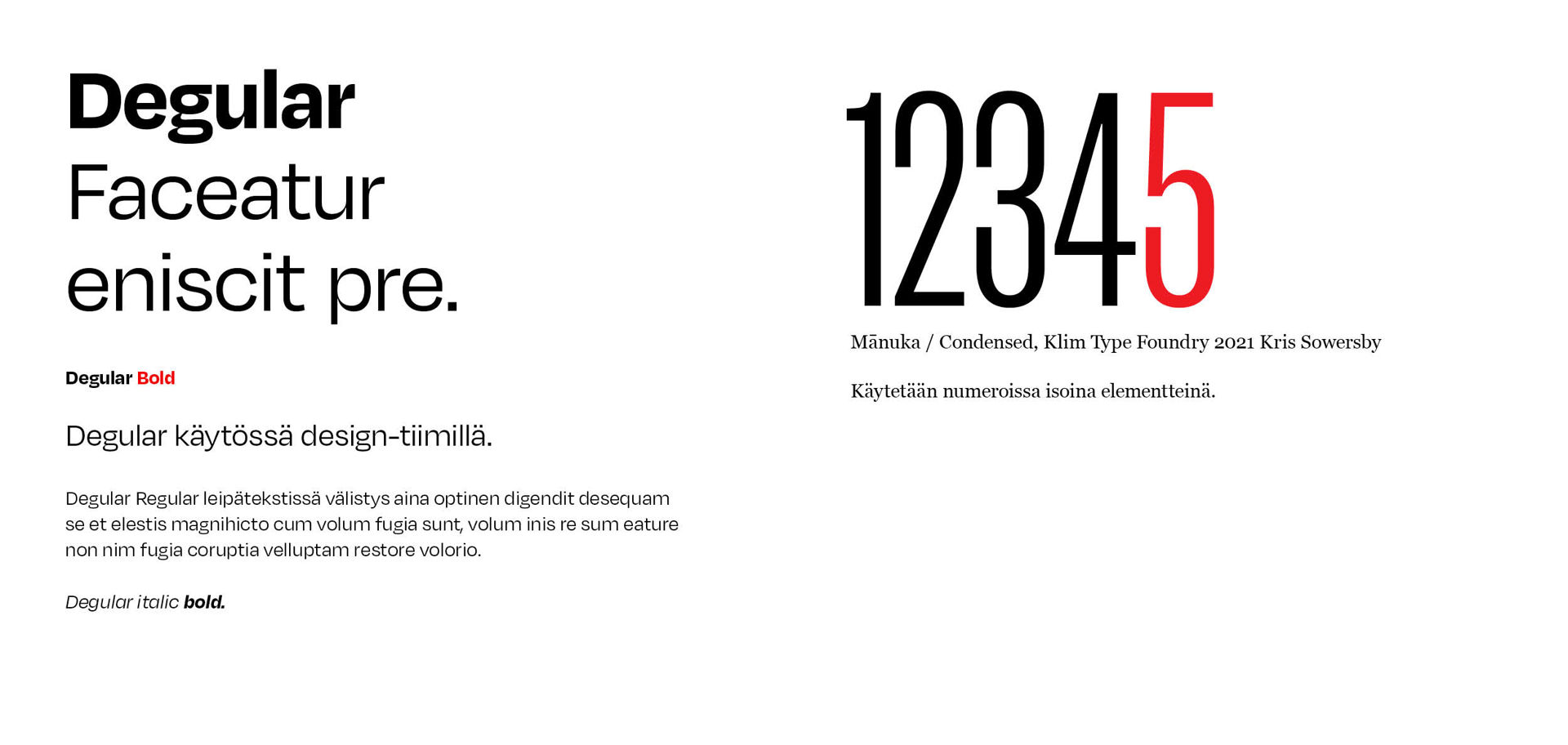
The primary fonts of the Finnish Red Cross are Arial and Georgia, which are available to everyone. The Finnish Red Cross design team also has the use of supporting fonts Degular and Mānuka.
